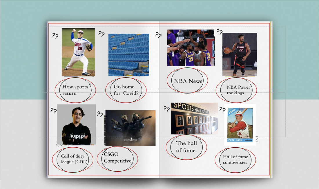
 This table of contents i made was designed to catch you attention to all the headlines and to see each picture individually without being cramped. To clarify the question marks are going to be page numbers when i figure our what page they will be on. This is also just a baseline and might change based on if i am going to need more then 2 articles for each subject i had on the cover (which i am sure is going to be a necessity) this is by all means not my final draft.
1. This TOC directs its attention to social members who are fans of sports. I added mostly all sporting photos to grab their attention as well as put the text in a circle/sphere shape that could look like a ball, This table of contents probably looks similar to others, however, my use of shapes, pictures, and page numbers placement is likely unique. 2. My magazine cover and table of contents so far does reach its target audience by the way it's designed and the colors used. This text would be distributed likely by digital and if it would be popular enough then likely by paper that would be distributed at sporting events if possible. The criticism i got on this sample is that it is too simple and seems bland which i would look to fix on my next drafting of this product.
0 Comments
|
AuthorWrite something about yourself. No need to be fancy, just an overview. Archives
April 2021
Categories |
 RSS Feed
